Avoid frustrating users with tabindex
Even if you can use a mouse most of the time its easier to use a keyboard to fill out web forms. HTML has a nifty attribute called "tabindex" which allows the site creator to dictate how the user will navigate through the forms or links on the page.
The default tab order is usually enough, most forms are filled out linearly and browsers account for that. Sometimes developers get overzealous and add unnecessary tab orders, making the forms a nightmare to fill out.
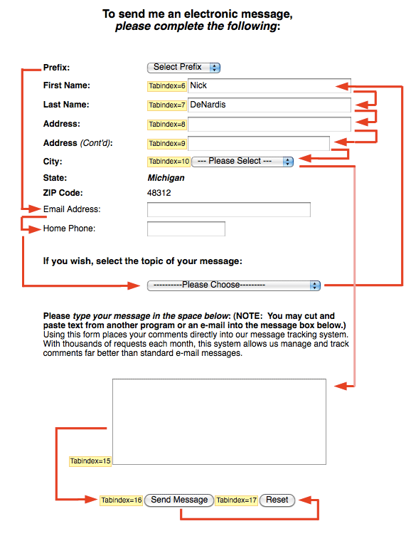
I encountered one of these nightmare forms the other day. I went to write a letter to my representatives (opens new window), and going through all the forms I eventually landed on this form. Long story short I started at the top and tabbed my way through it. But the fields led me in a crazy order.
# Try to follow this maze
# So what happened?
Half the fields had tabindex's on them, while the other half did not, it made for a pretty unique experience. On Firefox atleast it loops through all the non-tabindexed fields first then hits the tabindexed fields. I used the Web Developer Toolbar (opens new window) to display the tabindex's in yellow so you can see what I mean. Because these tab index's were forced there was no way to move from the Prefix field to the First Name field without using a mouse.
The lesson here kids is to use only what you need. Don't try to be user advanced technology when its not needed, you might just be frustrating more users than you help.
# Using the right tabindex
For 99% of all web forms created it is a good idea just to ignore the tabindex attribute and let the order of the fields on the page handle how the user flows through the form. Especially if the form will have new fields or or change frequently, its just another thing to remember to do.
For those one in a million forms that you have to use tabindex my suggestion is to test, test and retest every time you change the form. It would be very easy to forget once and have a large group of frustrated users on your hands.
