Don't abandon users, always be testing
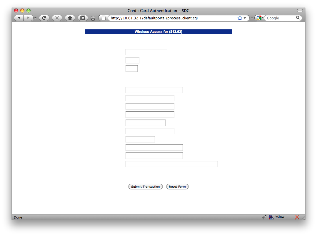
A few weeks ago at the CaseV conference (opens new window) I was trying to get wifi in the Chicago Sheraton (opens new window) and unfortunately it was not free, they charge by the day. I fired up my laptop fully prepared to pay the $13.63 for a day's worth of internet when I was presented with the form above.
# A few things struck me as odd.
The first of course was the inability to read the labels for each field. This made it very difficult to use unless you highlight the entire page (opens new window).
The second was the URL, it was a local address and the page was not protected by an SSL. No way was I going to put my credit card into a form without an SSL. Even a self signed certificate would have worked but CC information going over the air with potentially dozens of people able to intercept it does not sit well with me.
Last but not least the lack of instructions, terms or even description of what I was about to pay for really turned me off. Every customer asks "what is in it for me" before taking any action online. If the benefit doesn't outweigh the cost the user will not continue. In this case it's so unclear what the user is getting I would be surprised if anyone has filled out and submitted this form.
# Continuous testing
I'm sure they didn't design the form to be blank like this but whether it was the browser I was using or some change got moved to production that broke the form brings to light a very important lesson. Make sure you test all primary user paths every time a change goes in to production. It might sounds like a daunting task but something like this can easily happen if no one is watching. Just image how many people they are loosing because they didn't take 10 minutes to test their form.
