User manipulation with green buttons
Green means go right? Green also means positive, and lastly confirm. So why not manipulate a user's actions by placing a green button to confirm an action they might have otherwise not taken? That is exactly what I encountered a few days ago at a grocery store.
# The Setup
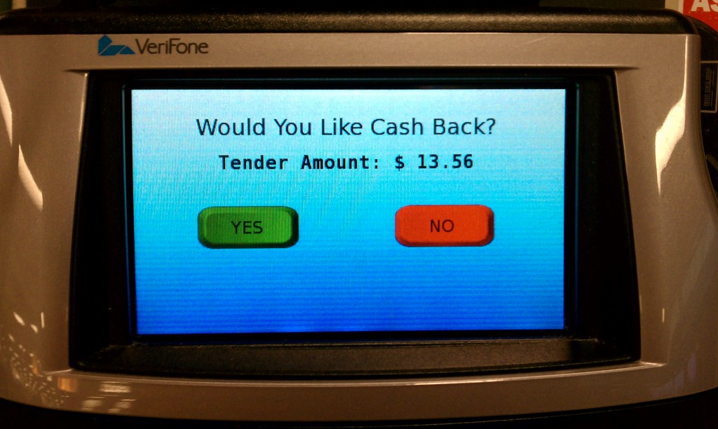
I went to the self checkout, scanned my few items, clicked to end the order and pay by credit card. After swiping my card I was presented with this screen:

# What I did
Typically when I see a screen like this: a large title, the total of my order and then a "Yes" and "No" button. I think to myself, "Yes I confirm this charge, lets continue." So naturally I click Yes because I didn't want to cancel, and then I was presented with this screen:

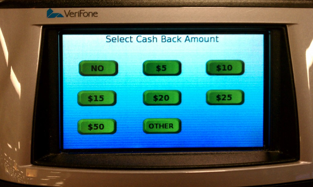
# Not what I expected
So now I was confused, why is it asking me for cash back? I just wanted to complete my order. So naturally I hit "No" and it went to the "Thank You" screen I expected before.
# What happened
After using the machine a few times over the course of a few days I finally realized what was going on. The question on the confirmation screen was not what I expected. It is asking for "Cash Back" and not to confirm the total at all. I then felt silly that I had missed this large print text.
Thinking to myself, "am I the only one who missed this?" I looked around for a few minutes as others were checking out. Four people checked out with credit cards, they were all presented with the same screen, two of them clicked "No" and went on with their day. The other two clicked the "Yes" button and in the same state of confusion paused for a minute before clicking the "No" cash back. Neither of them wanted cash back but yet still clicked the "Yes" button.
# Buttons can be dangerous
This reminds me a lot of Microsoft Windows and the issue it has had in the past with users installing spyware simply because they click an "Okay" button on a dialog box. They don't read the box they just assume that "Yes" is the default and preferred choice. It reminds me of a great TED talk by Barry Schwartz on the paradox of choice (opens new window). When presented with options users will choose the easiest way out.
The lesson is, as a user be careful about what you click. As a producer be good to your users, design to delight (opens new window), and not to fool them.