Redhook Long Hammer IPA - Standing out in the beer isle
I am not a beer snob or anything but I am always on the lookout for something new. Luckily my local Meijer (opens new window) has a pretty decent selection of craft beer. Previously I wasn't aware how hard it is for a small brewery to get regional or even national distribution until my friend Rob Vrabel (opens new window), home brewer, schooled me about it.
If you know me, you know I have a thing for great packaging. I am always on the look out for attention to detail, even in the beer isle.
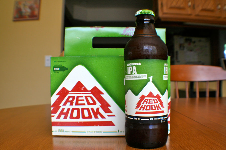
This week, Redhook (opens new window) Long Hammer IPA totally took my attention. I have never seen it at the store but it's package design stopped me in my tracks. So of course I had to buy it.
# Recently Re-aligned
Rob alerted me of Redhook's recent re-branding and re-alignment of their packaging. Beervana did a great job dissecting the new look (opens new window). It really shows they have insight not only in to themselves but also their current and potential audience.
# My Thoughts
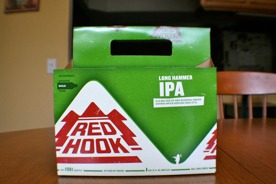
Simple Colors - The package isn't overly designed, simple, straight to the point. With a wall of images on other packages in the isles, the solid green, white and red stand out to the scanning eye. I just had to know what this beer was that decided they needed to make a statement.
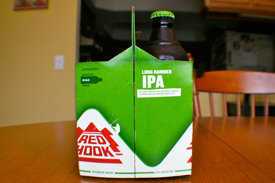
Bold Graphness - IPA's come in all different tastes. In the top left of the package on both the front and sides there is a graph that shows where this particular one sits, Bold. But it doesn't just state it is bold it also gives you where it sits in the realm of beers. "Refreshing, Smooth, Bold, and Dark", you know exactly what you are getting yourself into.
Microcopy - On various areas of the package there are some great examples of a copy writer who understands how to connect to their audience. Some examples are "Long Hammer IPA is a big fan of dry hopping, which sounds much dirtier than it is.", "30 years of cheer", "well built brew", and "Redhook would always enjoy himself responsibly. Do the same." Just to name a few. Check out the bottom which tells a great story too.
I'm turning 30. Let's have some brews
Who knows what led you to read the bottom of my six-pack. Maybe it fell and landed upside down. Maybe you're recycling. Maybe you've completely run out of decent reading material. But you know what? The why doesn't really matter. What's important is that we're having a little chat. Call me sentimental, but turning 30 has made me appreciate the times we habe out together all the more. So crack open a beer and let's have some time.
Cheers, Redhook.
P.S. If you're ever in Woodinville, WA or Portsmith, NH, be sure to swing by one of my pubs. Let's have a beer and I'll show you around the brewery.
Redhook himself - Inspecting the packaging a little bit more you will notice a little guy starting at the bottom of the mountain. Turning to the side as I took it off the shelf I notice he made it half way up, I thought that was pretty cool. Only when I took a beer out did I notice he made it to the top. Success! Just like me. This progressive climb matched my progressive experience with the product. After this I was totally impressed!
# Taste
After all of this the beer could have tasted horrible and I would still have been impressed. But as suspected it tasted as good as the amount of detail paid put in to the package design. Probably one of my favorite IPA's. Great job Redhook, all the way around! Trust me, if I find myself in Woodinville, WA or Portsmith, NH I'll be sure to stop in.
# Overall Grade
In the end I am giving Redhook an "A" for their entire package experience, taste and for the ability to gain an advocate with their attention to detail.


