Optimizing HTTP requests and CSS with @media
# Situation
 (opens new window)All of our sites have three style sheets, an “all”, “handheld” and “print” all necessary to a well rounded web experience.
# Problem
They come at a cost tho, three HTTP requests each page load. It doesn’t seem too bad when you get 1000 visitors a day or each file is only 100k but it get infinitely compounded when 40,000 visitors a day and the css weigh in at ~5kb total. Just in the access log alone that is 3 lines per visitor or ~160 bytes totaling ~6.4 megs of log data a day.
# Solution
@media – The hidden killer.. er.. saviour. Combining all those style sheets into one and using @media to separate the pieces.
# Example
@media all {
#content{
background: #0C5449 url(../images/content-bg.gif) repeat-y top left;
width: 706px;
}
...
}
@media handheld {
#content{
width: 100%
}
...
}
@media print {
#content{
background-image: none;
width: 100%
}
...
}
In the HTML:
# Results
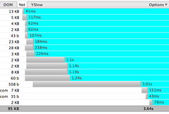
A reduction of 2 less HTTP requests and 2/3 less data being written to the access log. Compression saves ~20% of the css size but combining into one file reduces the overhead of the 1kb or 500b for the mobile and print style. Multiply that by 22% of our new visitors a day with an empty cache is a savings of ~24,000 HTTP requests a day.
I would say that its well worth it, reducing the amount of net traffic while still presenting the same amount of information. Although this is straight data without compression, things really start to get interesting when compression is added to the mix, stay tuned.