Form Errors - Validating phone numbers and the importance of hand testing
# Nothing replaces hand testing forms
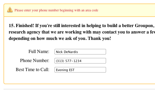
I fill out a lot of forms during the day, some on existing sites and others as new internal forms that need review. When testing I have a habit of submitting forms with every error combination possible. I know there are automated tools for this but nothing beats seeing it from the users prospective. It is different to run a command line tool and get a number of fails and successes as it is to spend 2 minutes to fill in a bunch of fields and get some weird screen state, odd colors or wording that doesn't make sense.
That is exactly what is happening above. I clearly filled out the form to my best understanding and still got an error.
# Things I notice about this error:
- There is something wrong with these three fields, but it doesn't point out which one(s)
- The wording of the error forces me to look up and then scan down to see where the field is
- In my mind I did place the area code in the phone field
- There is no explanation of the preferred format for the phone number
After understanding that my method isn't working and they were not going to automatically transform my format to their preferred format I tried every phone number combination I could think of. In the end none of them worked. Being the curious person I am I ended up digging through their validation javascript and found this regular expression it was validating against:
^((\\(\\d{3}\\) ?)|(\\d{3}[-\\s]))?\\d{3}[-\\s]\\d{4}$
Doing a little more investigation I found that it didn't work at all. Try every combination you can think of at: http://j.mp/9sIWEn (opens new window)
# Good error messages should include:
- A summary at the top of the page of all the errors (long forms usually push the user back to the top of the page)
- A highlight around each field with an error
- An explanation with an example or clear direction where the visitor went wrong
- Not be nit-picky about formatting, transform as much as possible automatically
In the end I brought this issue up to Groupon (opens new window) and they fixed it within an hour. The issue was not with their code, but on the survey vendor's site. It got me thinking about the time and effort the user has gone through to get to this point and end up confronted with a road block. These small things have the potential to be a huge turn off for the average user. Command line tools may be great but nothing replaces what you can learn by testing things by hand.
* Note, that is not my real phone number 😉
