Twitter UI hates lists
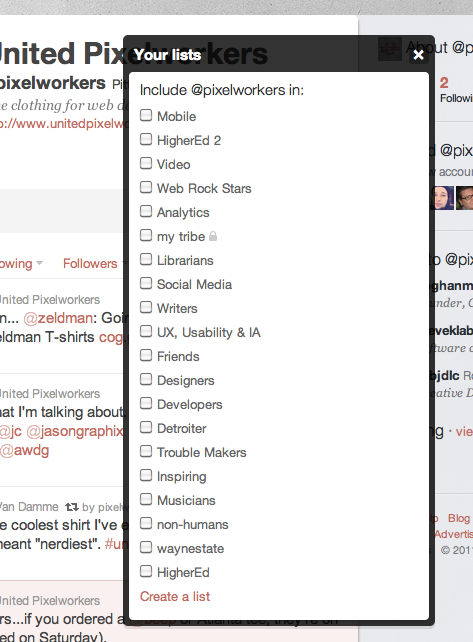
Today I noticed some changes to the Twitter (opens new window) list UI. Upon viewing a profile I thought to myself, hmm, this looks cleaner. I then realized a button was missing, the list selection. Looking around I couldn't find it anywhere. Clicking around I noticed they moved lists into the options menu, where I would normally go to Block or Spam a user.
This make logical sense especially if they are planning more features to go in this menu. But I have two problems with the change.
- It adds another click and wait to add someone to a list
- Previously that button was always associated with the negative actions for a user
Neither of these problems are earth shattering but it changes how I use twitter.com. I put every person I follow (and some I don't) into a list. Some of my lists (opens new window) are overflowing (opens new window) and a change like this leads me to believe Twitter is moving away from lists. Over the course of design changes, originally you were to be able to access lists on the right column directly as links. Now they are hidden above the main stream and even then it doesn't show you all your lists in one click.
# Less and less emphasis on lists
Changes like this can make a large impact on how users interact with a service. Although Twitter isn't publishing future plans things like this are great insight into what they think are important.
# Lists show expertise and authority
For me, seeing what lists a user is on tells more about them then their bio, the number of followers, or even who we follow in common. Twitter lists are like crowd sourced tags for users. It's an objective way to tell people what you are all about. The harder Twitter makes it to list people the less they will get used and harder it will be one less way to determine the "authority" of a user.

