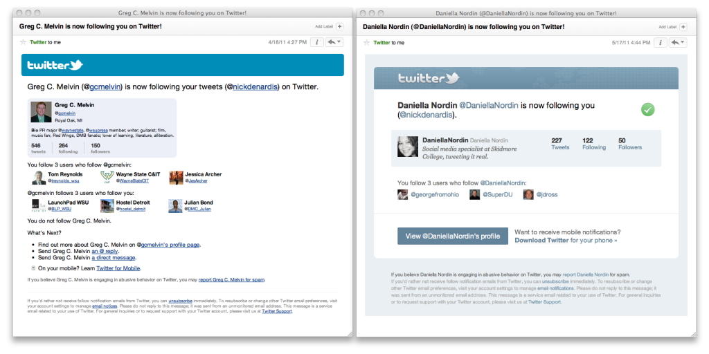
[Screenshots] New Twitter follower email format
Looks like Twitter (opens new window) just updated their "following you" email format. I haven't seen a reference to it on the Twitter Blog (opens new window) yet so it might be pushed out slowly. I have included screenshots of the old and new layouts above for comparison. A few things have been changing:
# Informationally
- The subject now includes the person's twitter handle
- Location is removed (personally I use it to determine if someone is spammy (opens new window))
- Removed the "follows x users who follow you" (think this was a good removal, no value lost)
- No more "What's Next?" to explain how to send an @reply or DM (is this assumed now?)
# Graphically
- Much more in line with updated Twitter homepage and overall look
- Not sure what that check box is doing up there in the top right (it is not clickable)
- The tweets/following/followers placement is far easier to scan
- The large blue "View @person's profile" is hard to miss as a next step
- Underlines have been removed from all links. The link and text colors are a little too close for my comfort, I wonder how #a11y (opens new window) experts think about the change.
Overall I think Twitter is moving in the right direction but still has a little ways to go. I would love to see the location added back in, links being underlined and the addition of how many lists the user is on. I think the number of lists is a great indication of the impact the twitter has in their community.
