The #NewNewTwitter in screenshots, my thoughts
Interested in the #NewNewTwitter (opens new window)? I was totally bummed by their "rolling out the redesigned Twitter over the next few weeks" and realization that it could be weeks before I could play with the desktop version. I have been following their (opens new window) changes (opens new window) for (opens new window) some (opens new window) time (opens new window). By chance I tried their trick of updating my mobile app and what do you know, within a few hours I got the #NewNewTwitter on my desktop.
Playing around with it a bit I found some things I really like and others that I'm not a fan of. I break them down below.
# Timeline
Actually pretty clean and I love the inline conversation view. Not a fan of having to click three times to get photos to appear large though. It took me a minute to figure out that there is "Compose a new Tweet..." input on the left side right under my user information, I actually find this quicker. 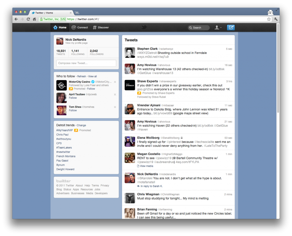 (opens new window)
# @Connect
They did a great job taking the information overload of the "Activity" tab and bringing some sanity to it. I found that the "Activity" is now located in the #Discover area, not gone, just placed with the "not exactly related to me" stuff. 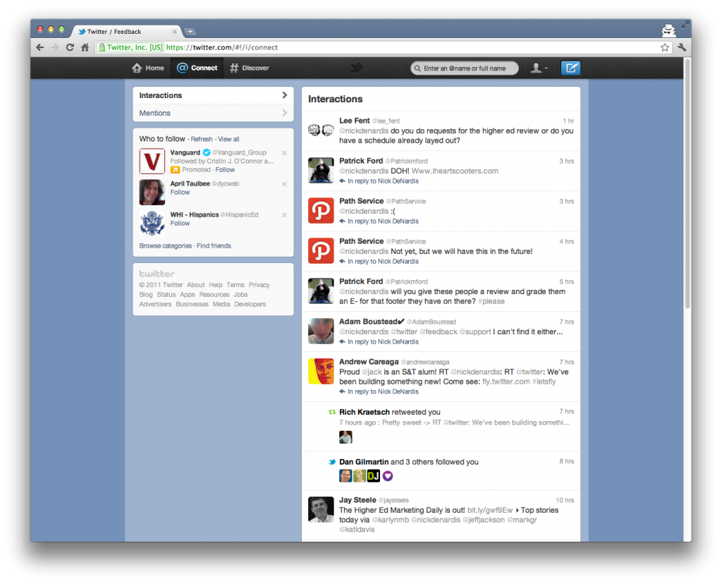 (opens new window)
# Conversations
Clicking on a tweet brings up the conversation inline. I like this because the three column sidebar before just wasn't enough room, especially if you didn't have a high resolution monitor. I wish it brought up the entire conversation though, not just the replied to and replied tweets. 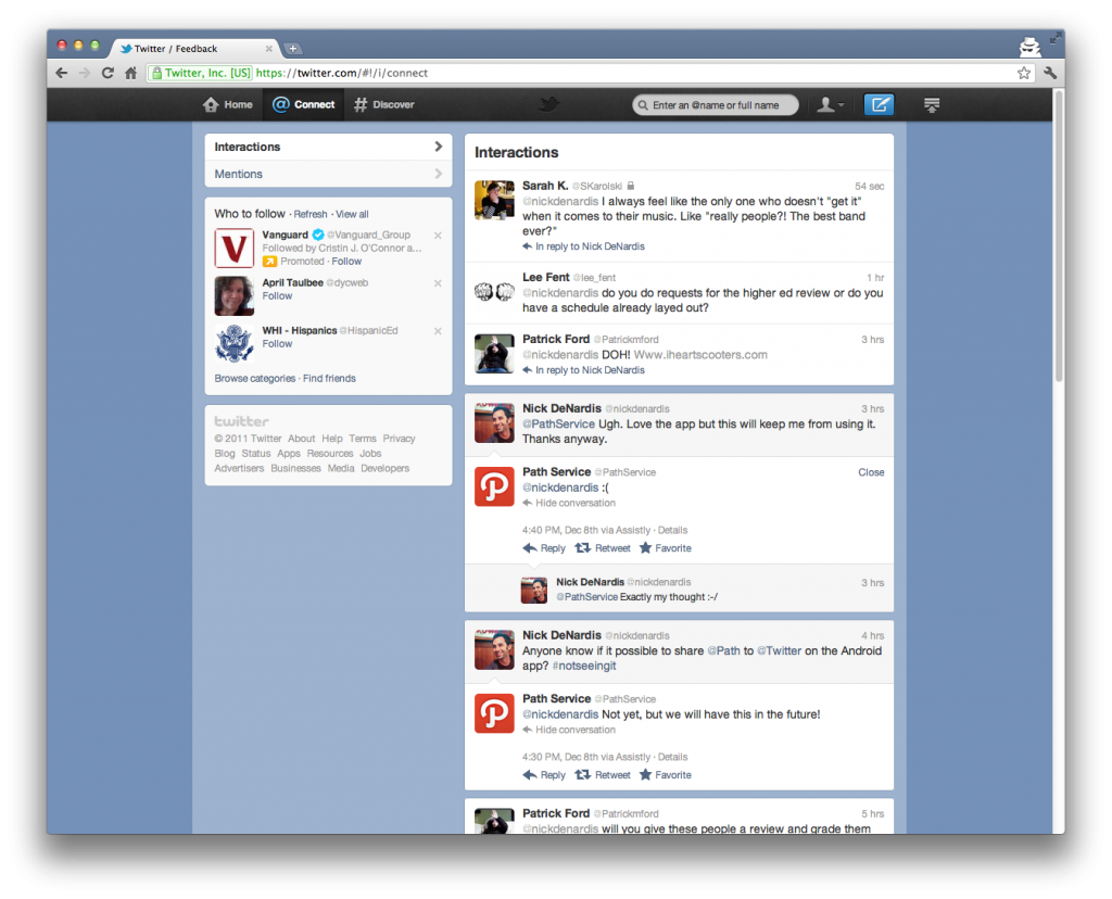 (opens new window)
# Lists
Again the interface took another hit against lists (opens new window). This time they tucked them away under the User icon -> Lists. At least this time you can get to them all on one page instead of only seeing half and having to click another link to get to the full list in the #NewTwitter interface. 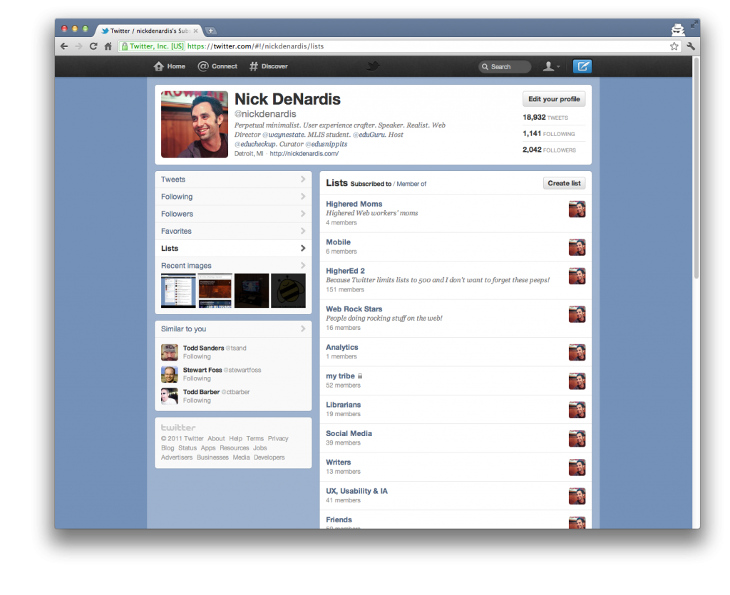 (opens new window)
# List Timeline
I really like the list timeline because it acts like the regular timeline. But my biggest complaint is the lack of context around what you're looking at. I feel like this page needs a header or breadcrumbs or something to identify the list. Maybe it's just me but the top left of the page feels too much like a user profile. 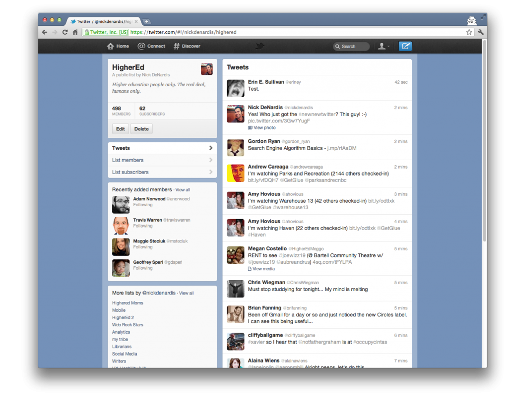 (opens new window)
# Direct Messages
If you use DM's at all you already know they took a huge UI hit in the mobile interface and now it is confirmed they are equally as hidden in the web interface. Hidden behind two clicks, Profile -> Direct Messages. As you can see from the shot below they don't even get a full timeline view. It's a shame. 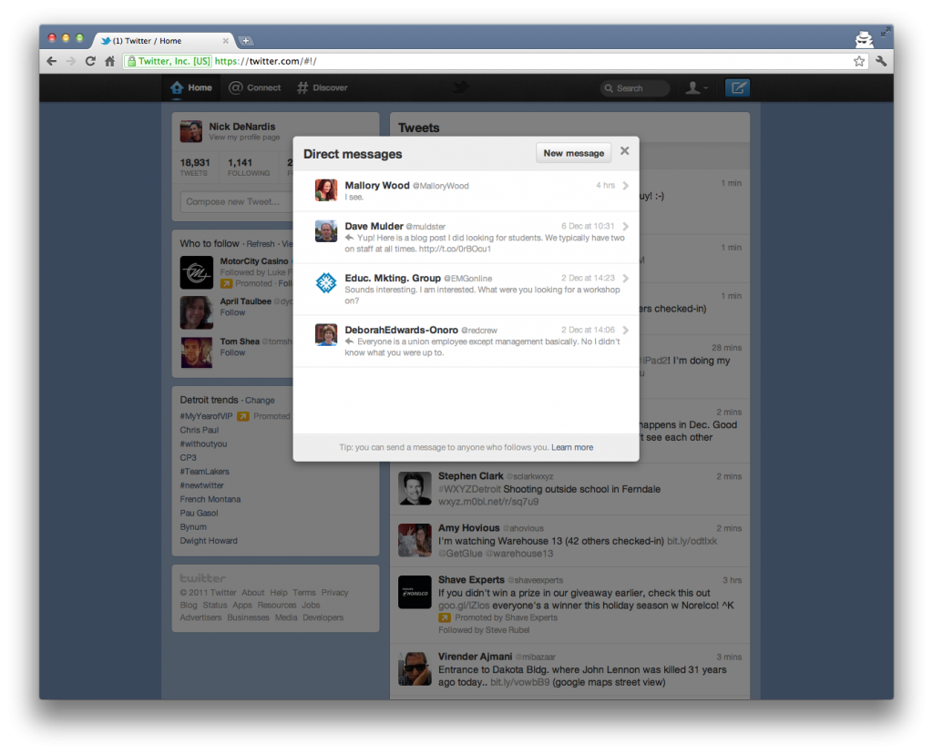 (opens new window)
# DM Conversations
Clicking in to a DM conversation the window doesn't expand and space is pretty limited. For me this just isn't enough room, I would prefer if more of the conversation was in view or at least you could resize the window. The style of the conversation is very nice, just wish it wasn't squeezed in a tiny window. 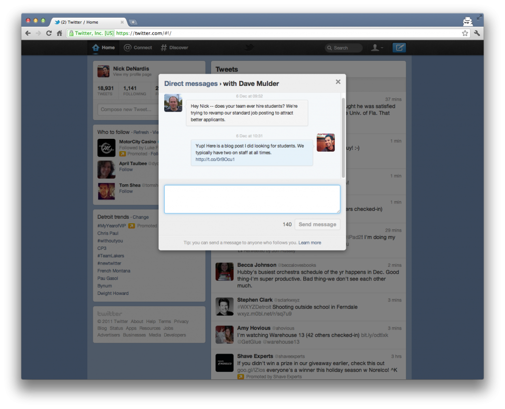 (opens new window)
# The Little Things
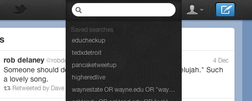
When focusing on the search box all your saves searches come up below. This is a nice change from the drop down menu in the older interface. It puts the search in the same context as the user's action.
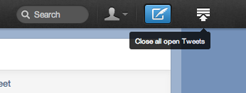
As you move through your timeline and click to view and open photos/videos/conversations the tweets start to space out. As soon as you open a tweet they offer a nice little "Close all open Tweets" button at the top of the page. Nice little big detail.
# Final Thoughts
Don't get me wrong, I really do like the direction Twitter is going with the increased emphasis on conversations but I just can't get past their continued hate toward Lists and now Direct Messages. By trying to pull in new users to explore they are excluding the seasoned users, but I guess that is what the Tweetdeck redesign (opens new window) is for.
Do you have the #NewNewTwitter yet? If so, what do you think?
